

Case Study
scafFold
An app which guides novice learners of programming through creation of their initial Java programmes. It helps learners practice concepts learnt in class, and creates memorable programming experiences through a gamified task-oriented approach.
The app was redesigned to focus more on its core feature — visually guided programming.

Client
The Cove
Consulting
Role
User Research
Wireframing
Prototyping
User Testing
Tools
Google Forms
Google Sheets
Pen & Paper
Adobe XD
Duration
Oct 2020 – Present
The Challenge
With this redesign, scafFold wanted to bring more focus and attention to the guided steps in place that hold the hand of a novice programmer, as well as making typically mundane learning exercises engaging.
The redesign builds upon previous work that aimed to support the learning of programming in resource constrained environments.
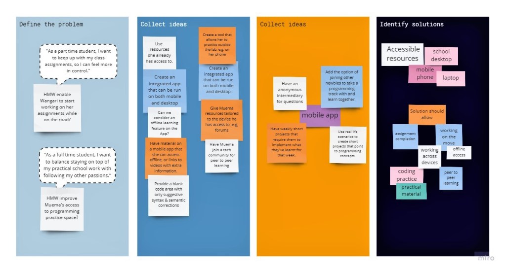
User Research
In order to understand the bigger picture, we wanted to dive fresh into the problem by getting to know what current and former learners think of and have gone through while learning programming at university.
To do this, we put out a questionnaire. This sought to learn more about the learners:
- level & fields of study.
- programming languages learnt in the classroom.
- challenges experienced in the learning.
- their mobile phone ownership.
- their willingness and/or experience learning programming on mobile phones.
Based on responses from 383 current and former learners, I led the assembly of our findings into personas and user stories to better visualize the learners we were designing for.

“As a full time student, I want to balance staying on top of my practical school work with following my other passions.”
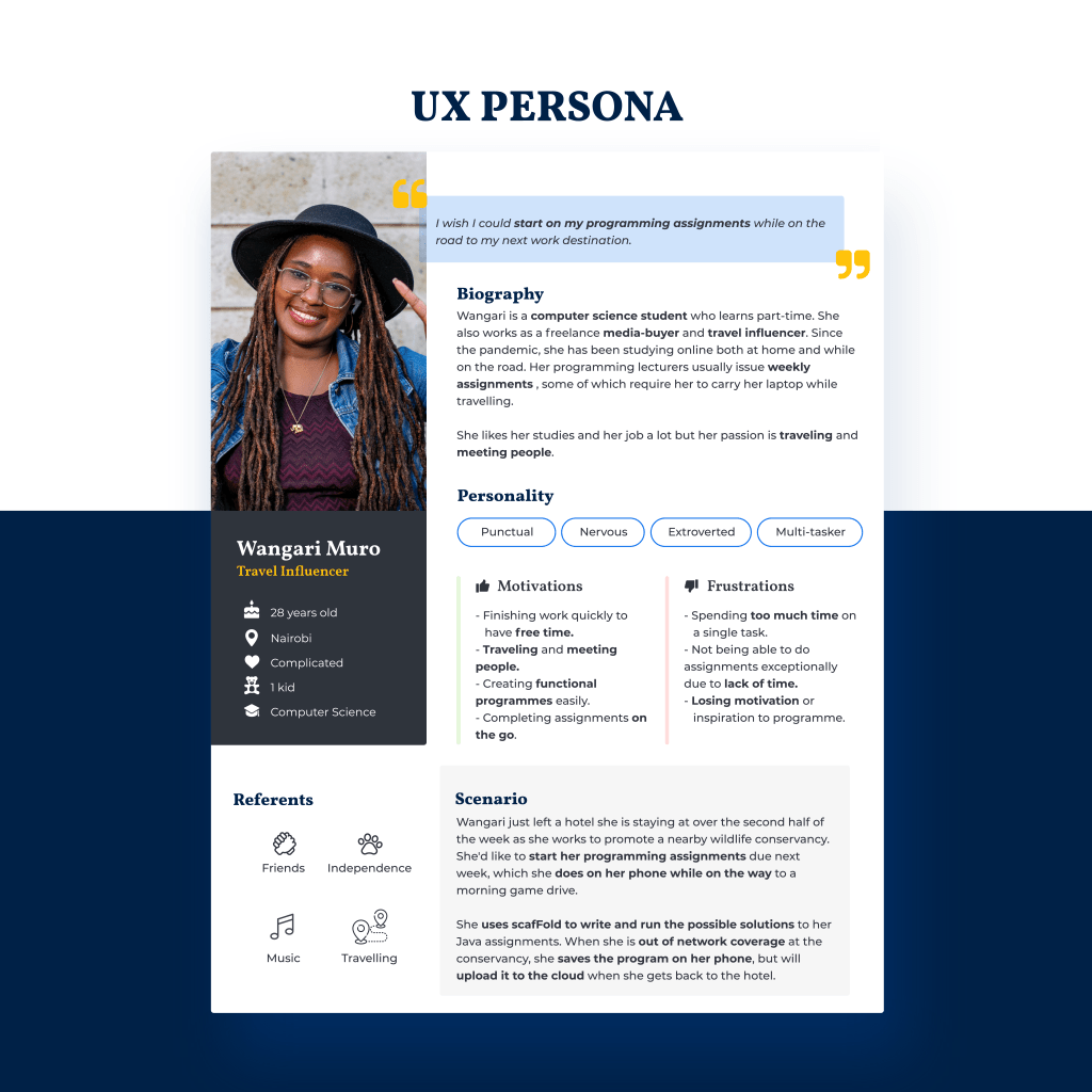
“As a part time student, I want to keep up with my class assignments, so I can feel more in control.”
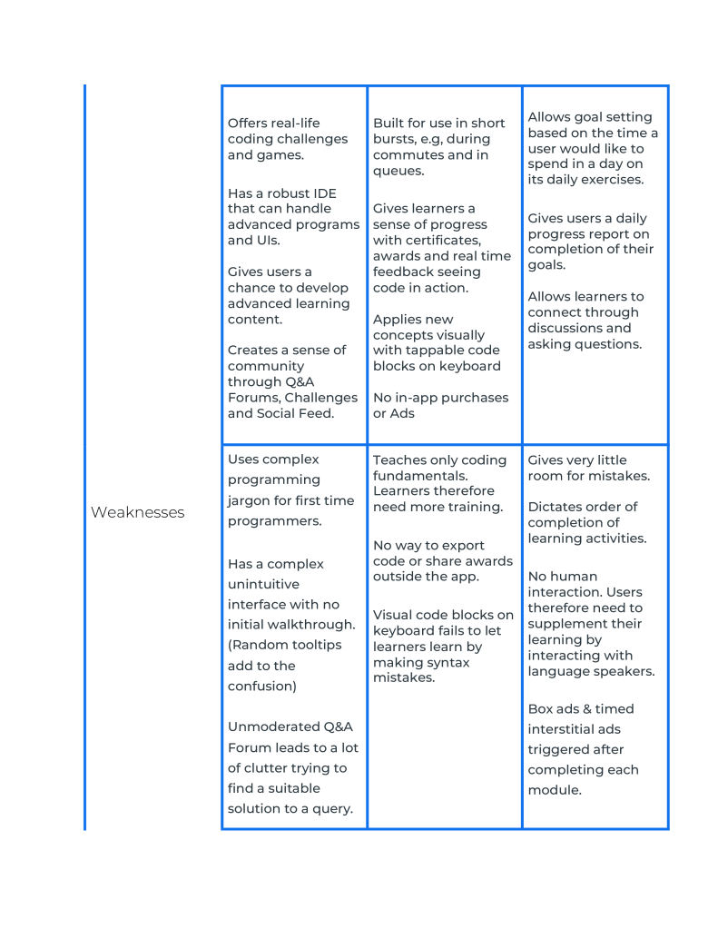
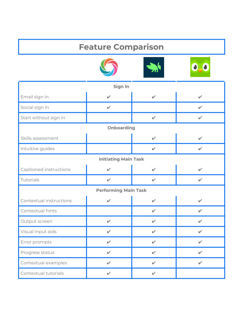
To understand the landscape of solutions crucial to the foundation of scafFold, I did a comparative analysis of the features, functions and flows evoked by the design solutions of leading mobile learning apps, some of which were mentioned by learners on their questionnaire responses. Together with listing out the strengths and weaknesses associated with each app’s approach to learning, I also evaluated the features associated with these user experiences:
- Sign Up & Login.
- Ease of account creation.
- Initiating the main task.
- Performing the main task.
- Completion of the main task.
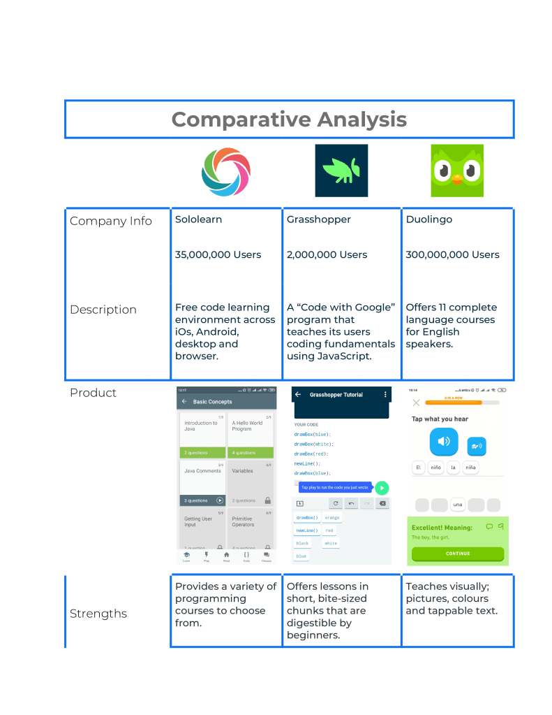
These findings lead us to gain a further understanding of what users might expect and how scafFold could improve that experience.
From our analysis, it is evident how users are:
- allowed to learn visually.
- encouraged to set goals to encourage their return.
- guided contextually through the interface.
- given real time feedback as they perform tasks.
- allowed to export their work for sharing or continuation elsewhere.
These approaches were put into consideration during ideation and for our re-design concepts.
Ideation
Brainstorm
I conducted a semi-structured virtual brainstorm with 7 current and former students in computing to further understand the problem space and their overall experience of learning programming with mobile apps.
The brainstorm further explored the problems revealed by the questionnaire respondents, created more empathy with the personas & went deeper into the kinds of solutions the students think would work.
Design
User Flow
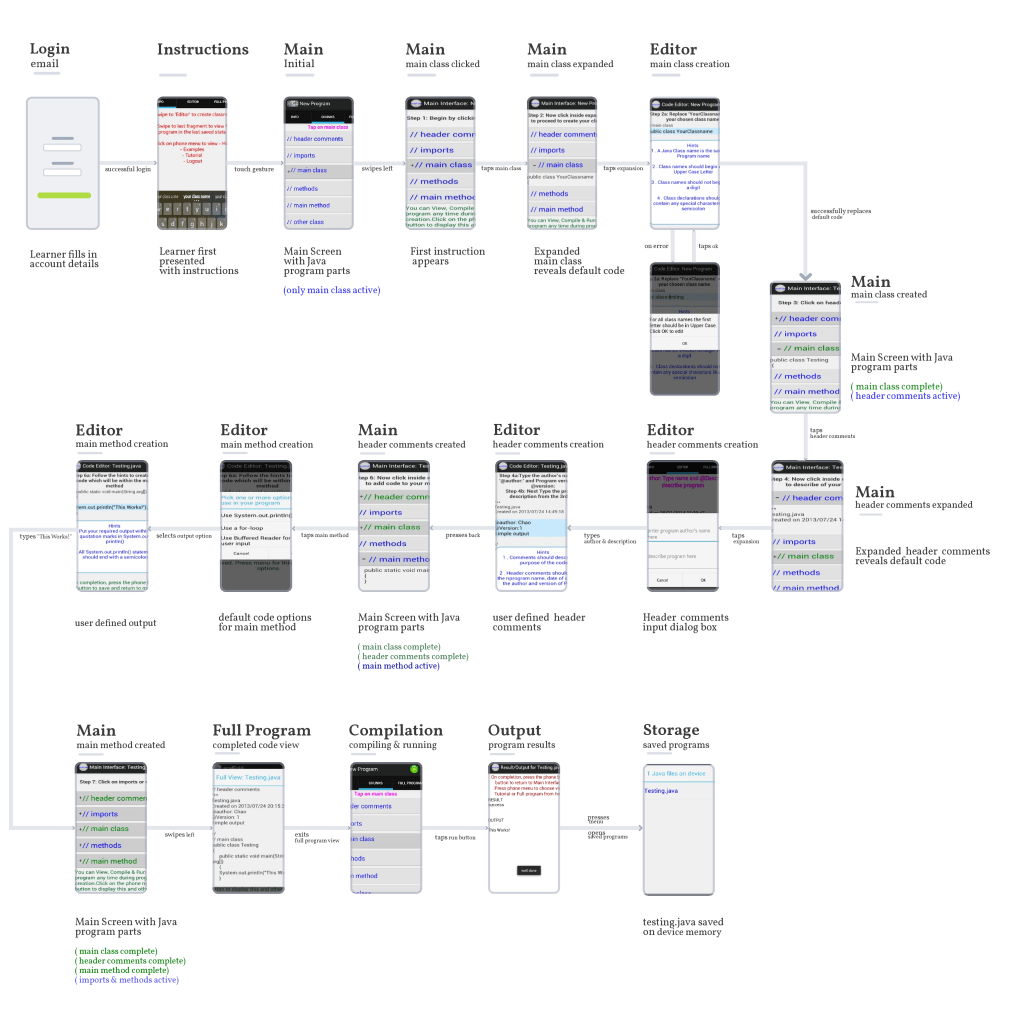
To inform the redesign process, we took on a task-oriented approach to analyse the current interface and how a learner goes about creating a program.
What is the learner trying to accomplish?
An assignment that requires them to create a Java program called Testing that outputs “This Works!”
What information does the learner need to do it?
- Which parts of the program to write.
- In what order to write those parts.
- The syntax to adhere to while writing the code.
- If they get stuck, hints of how to continue or an example of how the final part should look like.
- Once done with a part, whether their code is correctly written.
Current User Flow
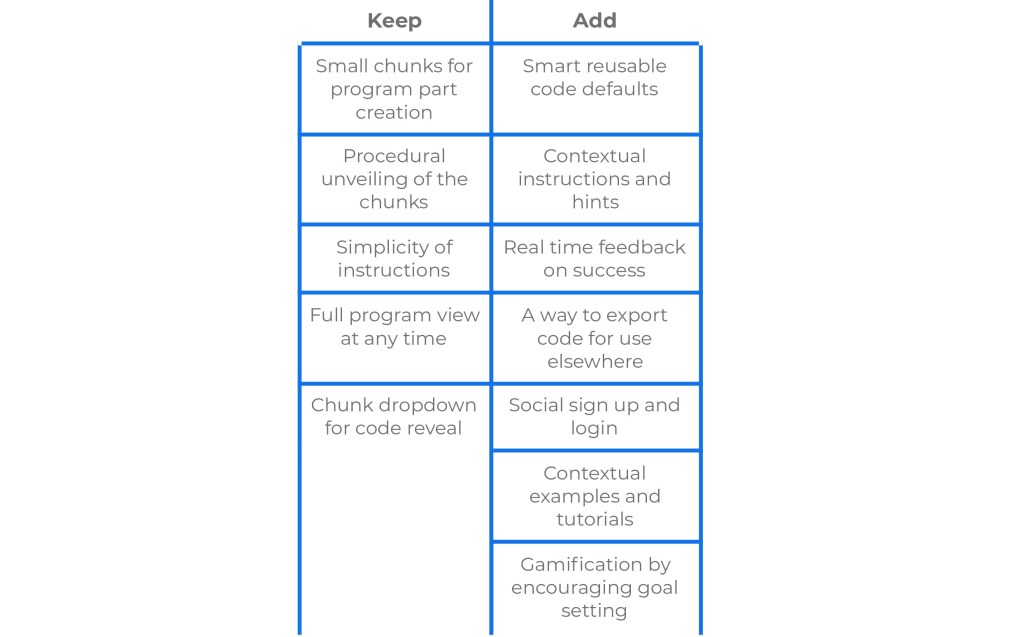
With scafFold’s current design, I looked into barriers in the user flow that might prevent the learner from accomplishing a goal. I found:
- A lot of information is provided at the same time, i.e, the learner is presented with both instructions and hints simultaneously.
- There is use of hints as instructions, which may be confusing to a new learner.
- All the hints for a program part are provided in one go.
- The learner is not made aware once they’ve successfully completed a program part.
- Program examples are hidden away in the phone menu creating friction as the learner is required to do more steps to get to them for help.
The key to designing great user flow is to present the right information at the right time while minimizing friction along the way. Learners will be more likely to convert if the product provides the information they need at the moment they need it.
Redesigned User Flow
The central task in redesigning scafFold involved looking for ways to present, at first hand, the minimum amount of information needed for the learner to correctly create a program part.
After iterating through preliminary sketches, I listed features I would keep as well as others I would add to address the identified problems and incorporate findings from the research phase.
Redesigned Screens
The Main screen is comprised of Chunks, Full Program, Run, Saved programs, Leaderboard, Profile.
Chunks – loads up on first login. At this point, all program parts save the main class are inactive. Progressive dismissable pop-up instructions will appear as the learner creates a program.
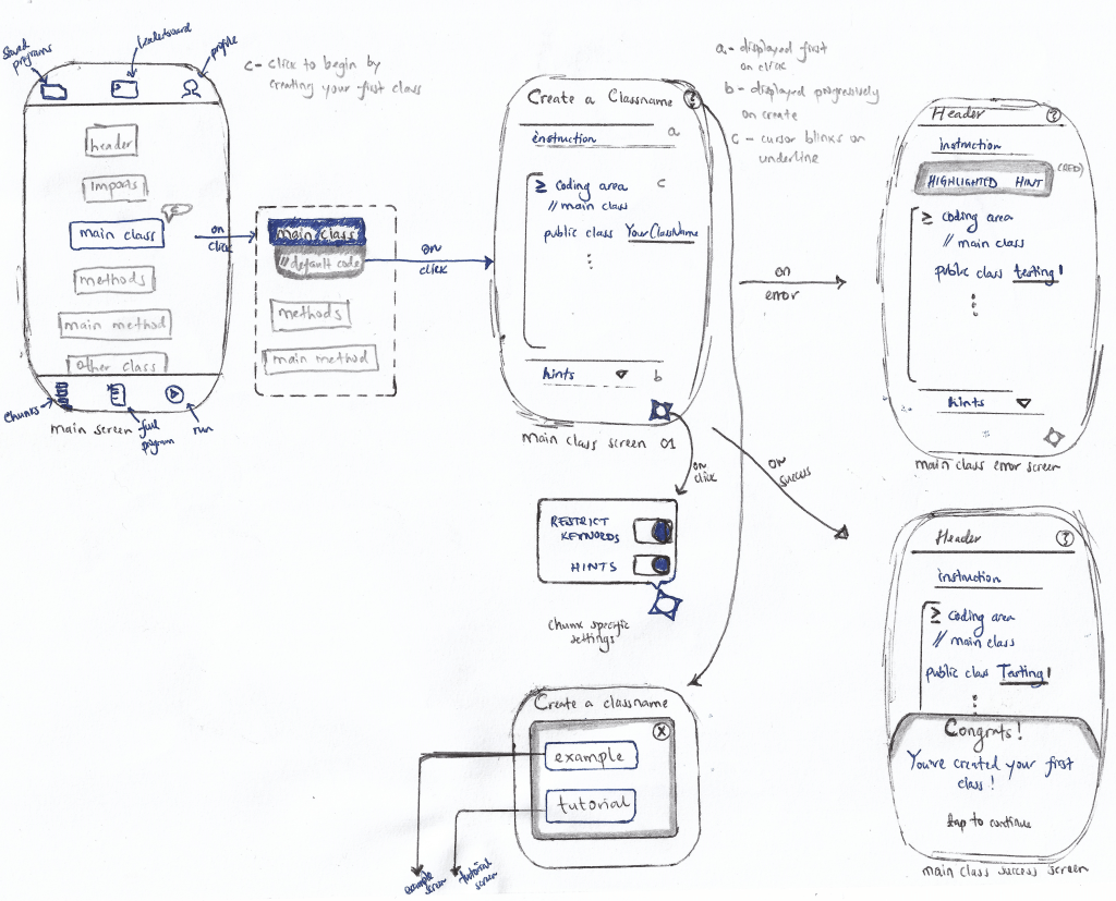
Editor
- Short instructions are displayed on top.
- Hints are displayed only when the learner has started writing code and encounters an error.
- A dropdown with all available hints appears only after a learner takes too long to correctly complete the program part.
- A setting toggle has been added on the bottom left to deactivate hints, keywords or reusable code defaults while coding. (only appears after 3 successful programs have been created)
- A help button to access examples and tutorials specific to that program part can now be found on the top right of the editor.
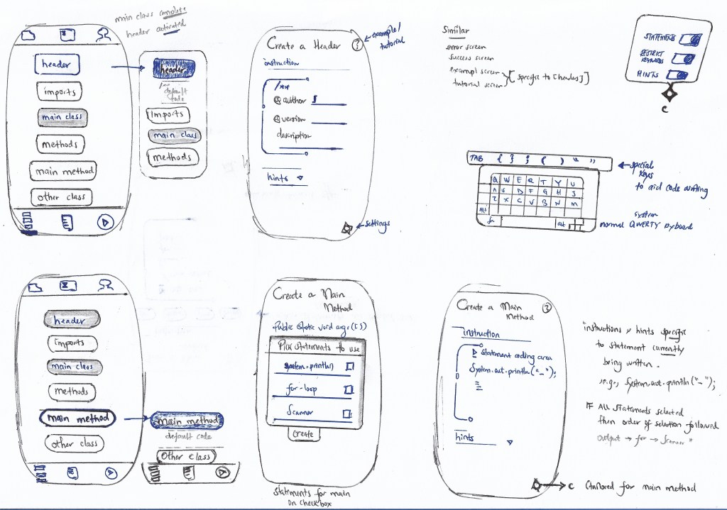
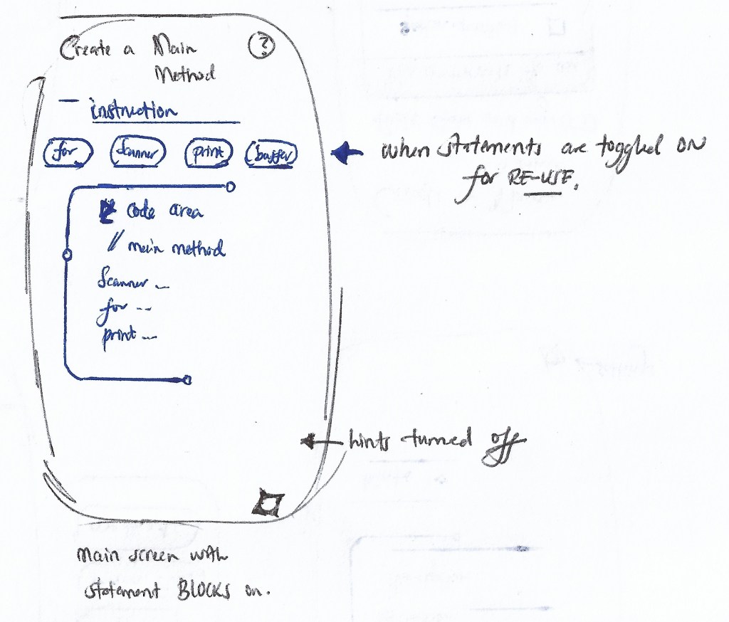
- Special re-usable keys have been added as input options, especially useful while writing the main method.

Example & Tutorial
- Example – presents the learner with example code specific to that program part and explains what each statement means.
- Tutorial – presents the learner with an explanation of what that program part does, then gives them an example and a multiple choice question to assess whether they’ve understood the concept.

Full Program & Run
- Full Program – displays the program as currently written by the learner. It’ll have syntax highlighting, numbered margins, and be scrollable but not editable. If a learner repeatedly presses a program section, they are redirected back to the specific chunk’s editor.
- Run – presents the program output as an overlay to the full program screen. If input is required, the input form overlays the full program screen.

Saved Program
- The learner’s programs are automatically saved locally after creation of the main class. The redesign has added searchability, allows for file manipulation, chiefly sharing and syncing program files to the cloud.
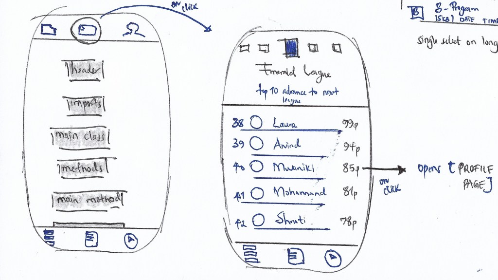
Leaderboard
- The leaderboard aims to encourage practice; learners earn points for every program they complete and this feeds into their weekly performance which can be traced on a leaderboard and tracked on their Profile Page.
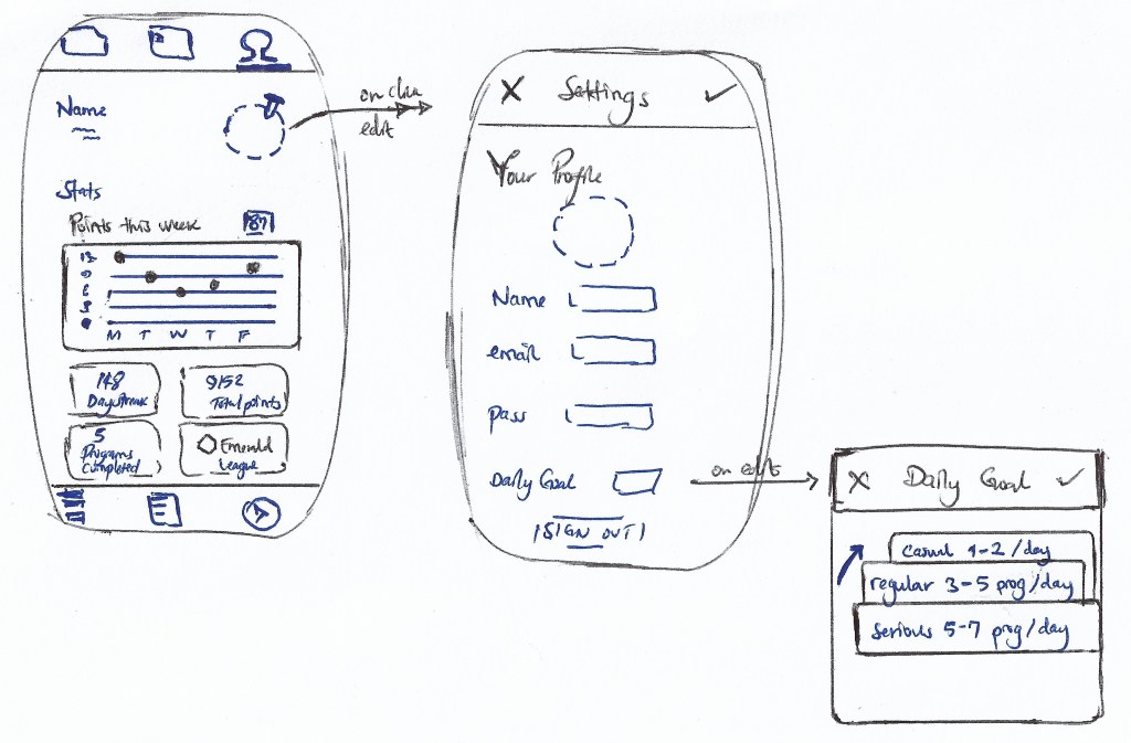
Profile
- I added this section for the learner to be able to personalise their experience with preferences as well as keep track of their achievements. It creates an easily digestible snapshot of the current status of a learner’s progress.
- Day streaks – the learner earns a day streak for each day they complete the number of programs they have indicated as their daily goal (on sign up). The day streaks may be used to ‘buy’ days off, e.g, weekends or busy travel days.
Next Steps
This project is by no means finished, we are currently building on our concept after the initial paper prototypes into a high-fidelity prototype that can undergo user testing.
We intend to recruit two sets of three-five learners to test out the high fidelity prototype. The task for them will be a programming problem that utilizes primary features of the app. An emphasis will be made on thinking aloud the experience while trying to complete the task on the prototype.
Reflections
From this project, I had a valuable experience gathering data and ideating with users who exist in the actual environment this application is designed to be used.
Although I was quite anxious at first to ask someone I did not know for a participation, at the end of the day, I learned that people were quite willing to help.
Lessons Learned
- Don’t design things in isolation – always place components in the context of the user to reveal more information about how they interact within the product.
- Peers are important – I wouldn’t have been able to iterate so many times on this design without my friends telling me it could be better. Learners (some who are my peers) will also provide a base for user testing of the high fidelity prototypes.
